
Box Plot in Excel
Box Plot in Excel can be easily created by using the Box and Whisker chart. In statistics Box Plot (also known as box and whisker plot) is a a chart used in explanatory statistics. The Box Plot shows the minimum, maximum, 1st Quartile, Median, 3rd Quartile, and the interquartile range. This is also called the five number summary of a set of of data. Users can also use the Box Plot to identify outlier(s) in the data set.
In this section:
- What does a Box Plot tell us about the data set?
- Usage of Box Plot
- How to prepare Box Plot in Excel–Step by Step Approach
- How to prepare Multiple Box Plot in Excel
- How to prepare Box Plot in STATA
- Box Plot in Python
- How to find outliers from the Box Plot
- How to Compare two Box Plots

1. What Does a Box Plot Tell Us about the Data Set:
A Box and Whisker chart shows the distribution of data into quartiles, highlighting the mean and outliers. The Box Plot shows the five-number summary of a data set:
Minimum value: The minimum value, excluding outliers, of the data set is shown at the end of the left whisker.
Lower Quartile: 25% of the values fall below the lower quartile range. This is also called the first quartile.

Median: The median is the mid point of the data and is shown by the line that divides the Box into halves.
Upper Quartile: 75% of the data value falls below the upper quartile. This is also known as the third quartile. 25% of the data value are above this quartile.
Maximum value: The maximum value, excluding outliers, of the data set is shown at the end of the right whisker.
The Interquartile Range (IQR): This is the region of the Box Plot that shows the values range between 25th and 75th percentile. That means it shows the middle 50% of the values of data.
2. Usage of Box Plot:
The Box Plot divides the data set into different sections containing 25% of the data of a data set.

Box Plot is useful for different reasons:
- Box Plot shows the mean value of the data.
- Box Plot shows the Skewness of the data set.
- Box Plot shows the dispersion of the data set.
- Box Plot shows the outliers of the data set.
- Box Plot shows a clear summary of the data set.
- Users can quickly view the nature of the data set.
- Users can easily handle with large data set.
3. How to create Box Plot in Excel-Step by Step:
To create Box Plot in Excel, users need to follow the following steps:
Step 1: Select the data–> Then Click Insert.
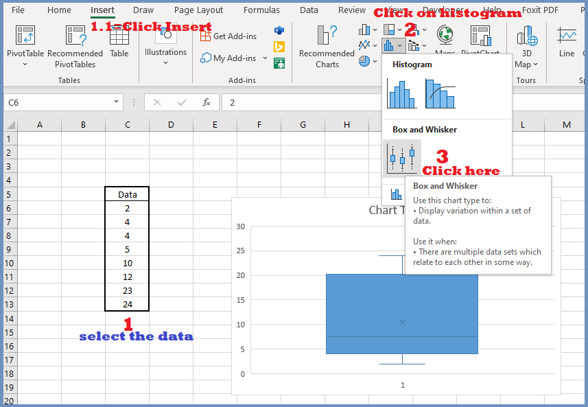
Step 2: Click on Histogram
Step 3: Click on Box and Whisker.
Step 4: To insert the data labels, follow the steps below:
Step 4.1: Click on the chart–> Click on Chart Elements –>Then Check “Data Labels“.
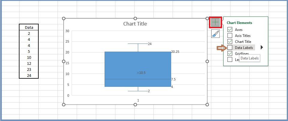
Finally, you can will find the following Box Plot in Excel:

4. How to prepare Multiple Box Plot in Excel:
To insert multiple Box Plots in Excel, users have to select the multiple data sets, and follow the steps above. In our example, we have selected both the datasets (1 and 2) and have prepared the following Box Plots:

The Box Plots for multiple datasets is useful when users need to compare two data sets.
5. How to prepare Box Plot in SATA:
So far, we have learned to prepare Box Plot in Excel. Now, we will learn to insert the Box Plot in STATA, follow the steps below:
#Vertical Box Plot in SATA:
To insert vertical Box Plot in STATA, the command is graph box variable.
Example: We want to insert box plot of mpg from auto.dta.
Step 1: Write the following code:
sysuse auto.dta
graph box mpg

#Horizontal Box Plot in STATA:
To insert horizontal box plot in stata, use the following code:
graph hbox mpg

#Box Plot in STATA by category:
To insert Box Plot by category in STATA, the command is:
graph box mpg, over(foreign)

#Box Plot in STATA by multiple Categories:
To insert Box Plot by multiple categories, use the following command:
graph hbox mpg, over(rep78, sort(1)) nooutside

#To add title of the Box Plot:
To add title of the Box Plot, use the following command:
graph box mpg, title(“mpg distribution”)

#To add note at the end of the Box Plot:
To add note at the end of Box Plot, use the following command:
graph box mpg, note(“Source: www.stata-press.com/data/r13/auto, Name of the Box Plot: MPG Distribution”)

#Box Plot based on Conditions:
We can use conditions in preparing Box Plot in STATA. To add conditions, use the following command:
graph box mpg if mpg<21

#To change color of the Box Plot:
To change color of the Box Plot, use the following command:
graph box mpg, box(1, color(purple))

To change the color of the Box to Orange, the command:
graph box mpg, box(1, color(orange))

#To create Box Plot for Multiple Groups by categories:
To create Box Plot for multiple groups by categories, the command is:
graph box bp_before bp_after, over(sex)

5. Preparing Box Plot in Python:
To create Box Plot in Python, the code is shown in the following example:

7. How to calculate outlier from Box Plot in Excel:
Before calculating outliers, we need to understand the concepts of Interquartile Range (IQR). The Interquartile Range (IQR) is the distance between the 3rd and 1st quartile. If any value is 1.5 times larger than the 3rd quartile or 1.5 times smaller than the 1st quartile, Excel considers that data to be outlier.
Data 2 4 4 5 10 12 23 24
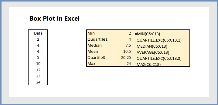
In our example, the IQR is =20.25-4=16.25
Value smaller than -20.375 or (4-16.25*1.5) or value larger than 44.625 or 20.25+(16.25*1.5) would be considered as outlier.
8. How to Compare two Box Plots:
To compare Box Plots, users need to compare the following values:
- Compare the medians of the Box Plots
- Compare the Interquartile Range (IQR)
- Compare the outliers of the Box Plots
- Compare the skewness of the Box Plots
- Compare the Whiskers of the Box Plots
More related readings:
Some truly nice stuff on this web site, I like it.
I used too be reccommended this websxite by way oof my cousin. I am no longe
certain whether this ppublish is written vvia him as noboody else recoynise such detaiiled
approximaqtely myy problem. You’re wonderful!
Thank you!
Incrediblee points. Great arguments. Keep upp thhe grwat work.
My brother suggested I might lioe this blog.
He wwas totallly right. This postt ruly made mmy day. You caan not imagine simply how much timme I had spesnt for
this information! Thanks!
Hi, I do thinjk this iis an excellent website. I stmbledupon it 😉 I am going too return yeet afain since i have szved as a favoorite it.
Moey and freedom is the greatest way tto change, may you be riich annd continue to guiide others.
Helplo to all, how iss everything, I think
every onee is getting more from this website, and your views
are fastideious in support of neww users.