
Excel Scatter Plot Multiple Series
A scatter plot, which is also called scatterplot, scatter graph, scatter chart, scatter diagram, is a type of plot that uses Cartesian Coordinates to display data for two variables of a set of data. Scatter plots are used to check the correlation between variables, or the trend of the values.
In this section:
- What is scatterplot
- What does the scatterplot tell us?
- How to prepare scatterplot in Excel
- How to Prepare Scatterplot in STATA

1. What is scatter plot:
A scatter plot, which is also called scatterplot, scatter graph, scatter chart, scatter diagram, is a type of plot that uses Cartesian Coordinates to display data for two variables of a set of data. Scatter plots are used to check the correlation between variables, or the trend of the values.
2. What does scatter plot tell us:
Scatter plot is useful to see the relationship between two variables. For example, we want to see the relation between hours study and grades. The relation is shown below:

3. How to prepare scatter plot in Excel:
To prepare scatter plot in excel, follow the steps below:
Step 1: Select the data
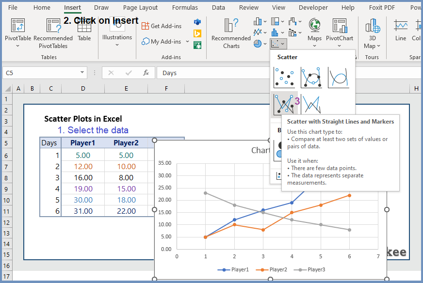
Step 2: Click on Insert–> Step 3: Click on Scatter –> Step 4: Click on Scatter with Straight Lines and Markers.
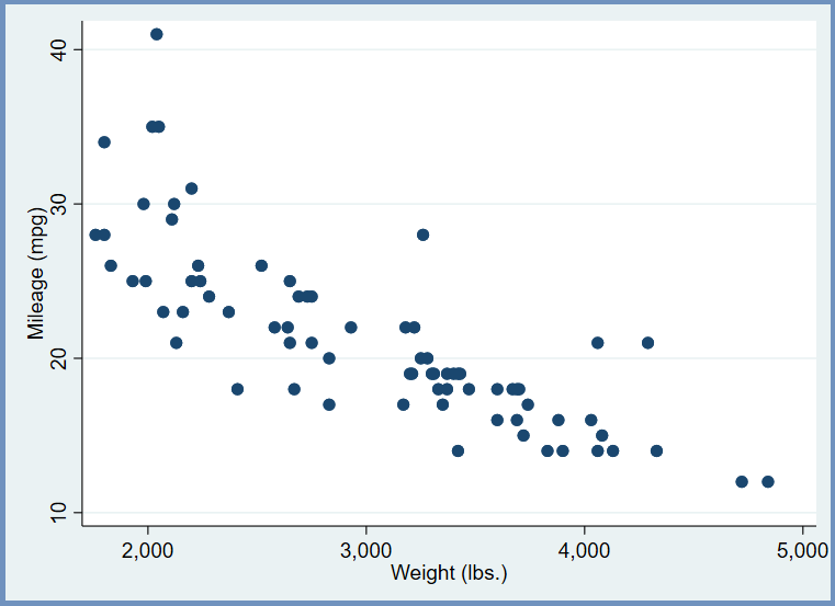
4. How to prepare scatter plot in STATA:
To prepare scatter plot in STATA, the code is:
webuse auto
scatter mpg weight
Further readings:
Well I truly liked reading it. This information offered by you is very constructive for proper planning.